Butter yellow is having a moment beyond just your Pinterest feed. This shade is popping up everywhere from Timothée Chalamet’s surprise Oscars look to Sabrina Carpenter’s soft yellow mini at the Governors Ball. Versace even anchored its Spring 2025 collection with it, proving butter yellow isn’t just a seasonal fling – it’s a full-blown style statement.
The best part? It’s translating beautifully from fashion into interiors. Butter yellow color is soft, warm, and nostalgic without feeling dated. It’s a color that brings light into a room without taking over the entire space. Think subtle sunshine and not screaming lemonade. If you’ve been looking for a fresh, comforting hue to work into your home, this is the one to watch. Think a yellow statement wall in an Atlanta home, a fuzzy yellow rug in a Charlotte apartment, or even butter-yellow kitchen chairs in a New Orleans rental home. Butter yellow is a color that fits anywhere while still standing out.
Why the butter yellow color works
What makes butter yellow color different from other yellows is its softness. It doesn’t shout. It glows. It’s that dreamy middle ground between pastel and punchy, offering warmth without overwhelming the senses.
“Butter yellow is having a major moment this season, making waves in both fashion and interior design,” Alex Carlier, founder of MyColorAnalysis AI, details. “After shining in Prada’s and Jacquemus’ latest Spring/Summer 2025 collections, this warm, sophisticated hue translates beautifully into home spaces. At My Color Analysis AI, we particularly love how it works wonders with crisp whites for a fresh look, soft grays for modern elegance, and deep navy for that perfect pop of contrast. What makes butter yellow special is how it brightens up north-facing rooms while creating a calming, stress-reducing atmosphere – it’s cheerful without being overwhelming, making it perfect for today’s need for comforting spaces.”
Interior design-wise, butter yellow is versatile. “Butter yellow works well in any setting because it adds cheerful vibes to every room. The interior design world has adopted this color because it complements both bold and neutral color schemes,” Rachel Bustin with Home in the Pastures uncovers. “The combination of butter yellow with deep blues or earthy greens will help you build a balanced and welcoming environment.”
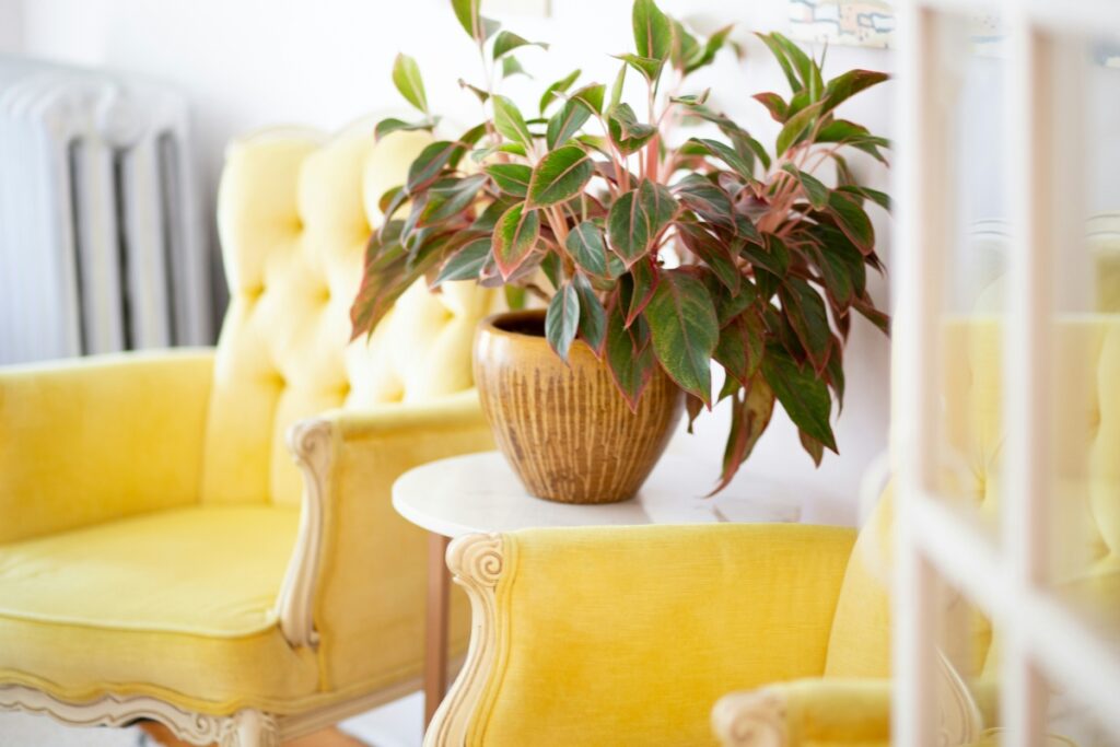
The flexibility extends into interior design styles, whether you’re into vintage charm, Scandinavian minimalism, or cozy cottagecore, this color can flex to fit your vibe. “Butter yellow is the standout shade of 2025, bringing a soft, nostalgic glow to interiors,” Philip Booth with J and P Hats explains. “Designers are embracing it as the new neutral, using it in everything from color-drenched walls to statement furniture and retro-inspired accents. Its versatility allows it to pair effortlessly with earthy tones, muted blues, or bold patterns, making it ideal for both minimalist and maximalist aesthetics. Whether through a buttery velvet armchair or a sunlit kitchen backsplash, this hue adds a cheerful yet grounded warmth to any space.”
Easy ways to use a butter yellow color at home
You don’t have to repaint an entire room to lean into this trend. Small shifts can have a big impact. Here’s how to bring in that buttery goodness:
Color drenching or statement piece
“Butter is the ultimate new neutral in this playful take on color. Bolder than beige, with a European edge and versatility at its core, butter yellow blends as seamlessly with cozy pastels as it does with an unexpected pop of red,” Becca Stern, co-founder and creative director of Mustard Made explains.
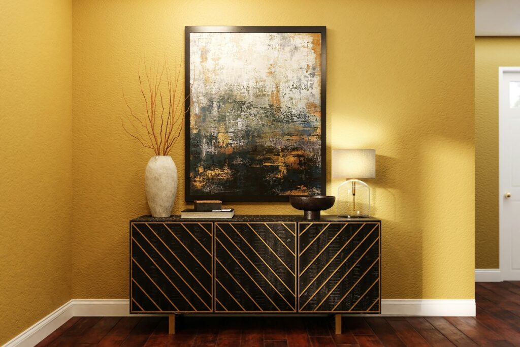
“With a timeless air and an undeniable nod to luxury, Butter is here to stay and is perfect for both renters and homeowners. Add this golden, sunny hue to the walls and experiment with color drenching, or if you’re limited with decorating, a statement piece of furniture or some carefully curated table-scaping accessories can work wonders to bring in this creamy shade.”
Textiles
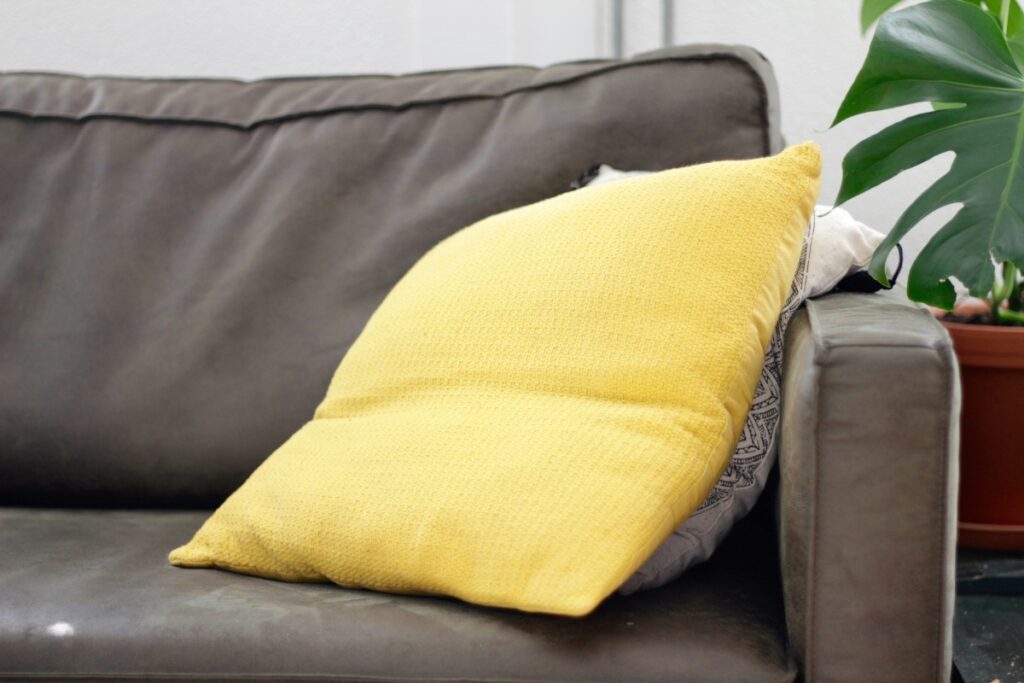
Texture is an easy, beginner-friendly way to work yellow into your decor scheme. Swapping out your usual throw pillows or bedding for butter-yellow versions is a simple way to begin your butter-yellow journey.
“Butter yellow, with its gentle warmth and inherent optimism, offers surprising versatility in interiors. Its current popularity stems from a desire for comforting yet uplifting environments,” the team at the International Journal of Ayurveda Orientation shares. “To decorate effectively, consider using it as an accent wall for a subtle sunny touch or in textiles like throws and cushions for a cozy feel. Complementary palettes featuring soft greens, muted blues, or even contrasting charcoal can truly make this soft yellow shine.”
Aside from textiles and throws, other textures can soak up butter yellow beautifully. “Butter yellow is a soft yet fresh hue that truly comes to life through texture. Explore styling this color in your home through different materials, such as linen, silk, or wool, as your experience of the color can vary according to the fabric you choose,” Fifi with Curate Your Style. “You can style butter yellow with grey, dusty blues, or navy, or, with pink to add vibrancy to your living space.”
Small decor items
Butter yellow is such a fresh, joyful hue, and one of our favorite ways to use it is through unexpected details that quietly brighten a space. Molly Lucas with Maison de Molly continues, “Think picture frames, vases, sculptural objects, or even painted trim and baseboards. It brings warmth without overwhelming a room and pairs beautifully with soft blue grays, dusty teals, muted olive greens, and warm whites. These subtle, curated touches allow renters and homeowners alike to embrace the trend without a full commitment — it’s like adding a bit of sunshine exactly where you need it.”
Leaning into decor styles
Butter yellow naturally appears in design styles like cottagecore and French country, adding warmth to vintage pieces and soft neutrals. It also brightens mid-century modern and retro spaces, offering a cheerful pop in kitchens and accents.
“Yellow is a cheerful color for any space. It can be used as a neutral or a statement color. I enjoy using soft buttery yellow which lends to a creamy neutral. Its softness makes it easy to layer and gives a European Cottage feel,” ANG and JOEY explain.
Pairing with other colors
As other experts touched on earlier, pairing butter yellow is flexible, fun, and simple.
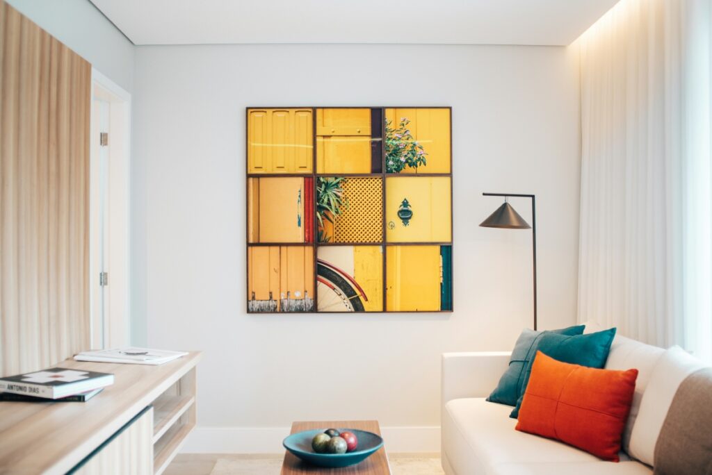
The color combinations are endless, as this yellow shade can serve as a neutral. “Butter yellow is a breath of fresh air — it radiates warmth, optimism, and a touch of nostalgia, making it a perfect choice for brightening up modern interiors. I love using it in kitchens, reading corners, or even cabinetry, where it adds character without overwhelming the space. It’s wonderfully adaptable: pair it with warm wood tones, soft whites, or muted greens for a calm, natural look, or introduce bolder accents like navy, terracotta, or dusty rose for a more playful edge. It’s that rare color that feels both comforting and current — perfect for anyone looking to bring joy and personality into their home,” Jessica Langco with Sara Carroll Design details.
Butter yellow in different rooms
This creamy yellow shade is sure to complement any room. “Butter yellow is such a beautiful shade of color. Use it to literally brighten and bring warmth,” Stacee Amos with The SugarApple explains. “Use it in the kitchen with dish towels or dinnerware, in the bathroom or bedroom with lamp bases or linens, and in the living area with storage baskets and blankets. This shade will bring joy to any room.”
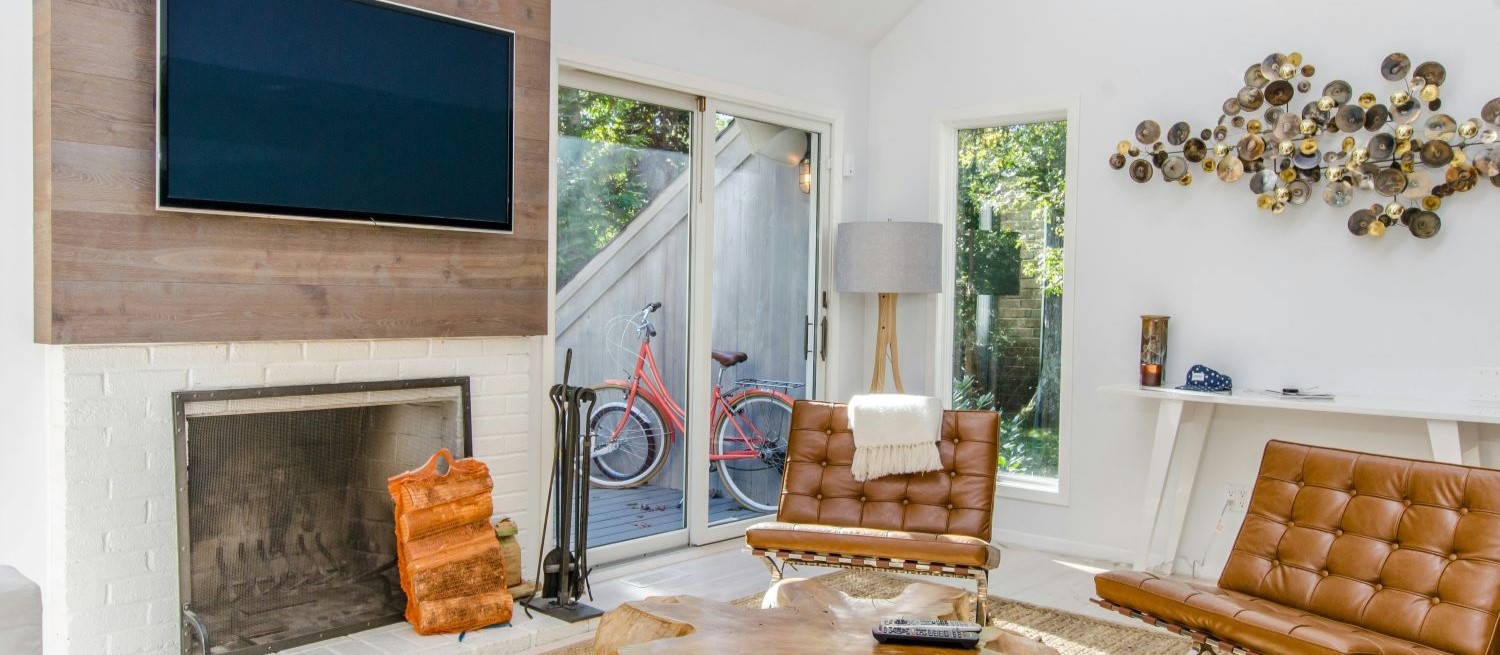
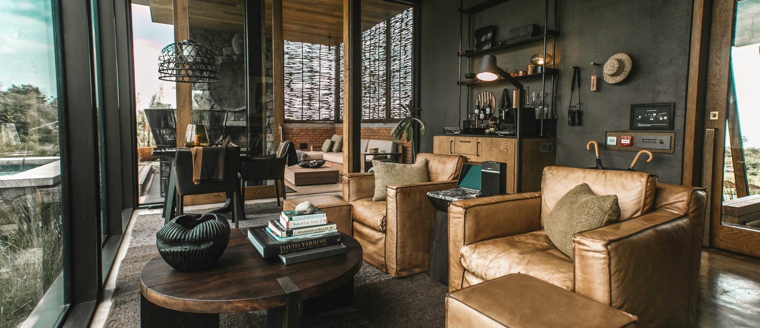
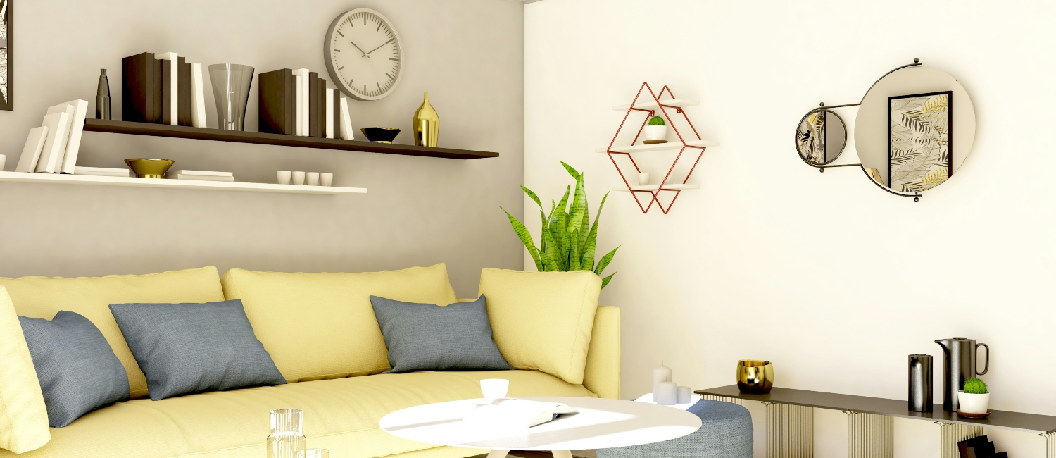
- Living room: A butter-yellow armchair or lamp adds warmth and breaks up cooler tones.
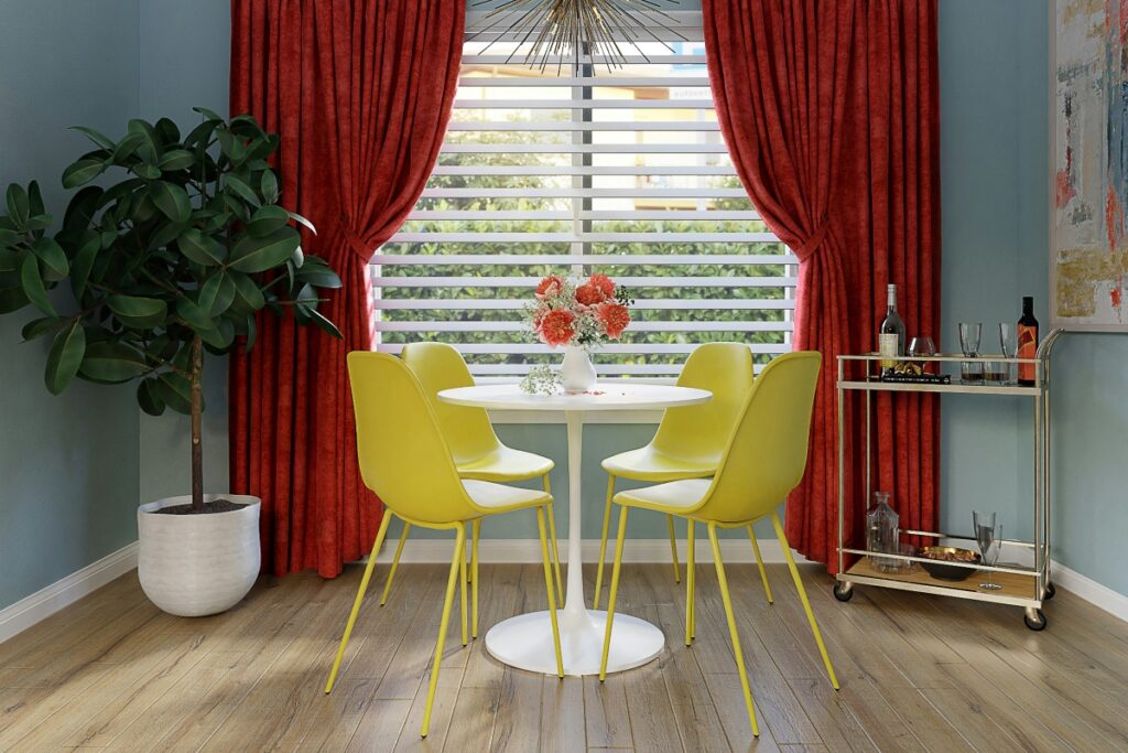
- Kitchen: Try butter-yellow bar stools or tile backsplashes for a vintage yet modern feel.
- Bedroom: This color is perfect for duvet covers or curtains, creating a calm, cozy backdrop for rest.
- Bathroom: A pop of butter yellow in towels or bath mats adds cheer without clashing with neutrals.
Regardless of where you place butter yellow, it’s sure to shine. “Butter yellow brings a soft, sunny glow that makes any room feel warm and welcoming,” Anastasiia Stepanova, founder of Dressika, an AI-powered color analysis app, explains. “It’s perfect for brightening up small spaces like bathrooms or entryways, and adds charm to kitchens and dining areas. Pair it with light woods, white accents, or soft greys to keep the look airy and modern.”
A fresh take on color
Butter yellow color isn’t trendy in the flash-in-the-pan sense. It’s understated, nostalgic, and easy to love. It brings light and personality to spaces that need a little lift, and unlike more saturated yellows, it doesn’t dominate.
If you’ve been looking for a subtle way to shift the mood in your home, butter yellow is a solid choice. Warm, welcoming, and a little unexpected. It’s one of those colors that feels like it’s always been there — even when it’s brand new to your space.