The 2025 Academy Awards have brought together a striking selection of Best Picture nominees, each showcasing its distinctive design and unique aesthetic. From historical epics to musicals, the visual elements of these films play a crucial role in shaping their storytelling and emotional impact. Let’s explore the design choices that define this year’s top contenders and how we can apply those visuals to a rental home in Spokane, WA, an apartment in Rochester, NY, or a home in Fort Collins, CO.
Exploring the design of the 2025 Oscars Best Picture nominees
Whether it’s the lavishness of historical dramas, the chic minimalism of sci-fi worlds, or the cozy nostalgia of period pieces, cinema has a unique ability to dictate trends and redefine aesthetics. This year’s Oscars Best Picture nominees each bring a distinct visual identity, offering a glimpse into styles that may soon find their way into our homes.
All movie rating percentages are from Rotten Tomatoes. The scores indicate the percentage of audience and critics who enjoyed the film.
Emilia Pérez
Audience score: 17%
Critics score: 72%
Leading the nominations, “Emilia Pérez” captivates with a fusion of bold cinematography and intricate production design. The film’s aesthetic seamlessly blends contemporary settings with rich cultural influences, crafting a world that feels both grounded and theatrical. Every frame is thoughtfully composed, enhancing the narrative’s emotional depth with warm, earthy tones and deep contrasts that evoke intimacy and tension.
The Brutalist
Audience score: 80%
Critics score: 94%
“Writer/director Brady Corbet’s ‘The Brutalist,’ filmed in stunning VistaVision, follows Jewish-Hungarian architect László Tóth as he immigrates to America in the 1950s, seeking to resurrect his career in brutalist architecture,” Eric Zimmerman with Reel Opinion details. “The film presents enormous concrete and Italian Carrara marble constructions, with pillars dozens of feet high that entrap the viewer within Tóth’s monoliths and reflect the movie’s exploration of the dark heart of America. Tóth’s work balances minimalism and maximalism, exemplified by a library with towering bookshelves that retract into the walls, and its only furnishing is a chaise lounge positioned beneath a shaft of sunlight.”
Kyle A. Goethe, with GOAT Film Reviews, explains the thoughtfulness behind the production design, sharing the deeper meaning behind design choices. “Brady Corbet’s ‘The Brutalist’ is THE production designer’s dream of 2024. Chronicling a Hungarian-Jewist architect (played by Adrien Brody) who arrives in the United States to find the American Dream is always out of reach, this lengthy epic features some of the most unique and captivating architectural works of any recent film. The gargantuan concrete building at the film’s center evokes minimalist designs and coordination with natural light sources to create an awe-inspiring and ambitious project for its ambitious central character to pour all of himself into. This building, an institute, is similar to a blank slate, moving forward rather than back, much like its central character, a Holocaust survivor.”
This movie embraces stark architecture and moody lighting to underscore its themes of ambition and resilience, as Goethe explains. The film’s muted color palette and precise use of space create a sense of isolation that mirrors the protagonist’s journey. “One of the standout nominees for Best Production Design is ‘The Brutalist,’ which employs a minimalist aesthetic characterized by raw concrete structures and a muted color palette,” Jens Jacob with Saturation.io emphasizes.
“This design choice not only reflects the film’s somber narrative but also emphasizes themes of isolation and resilience. In home décor, incorporating elements of brutalism — such as exposed materials, clean lines, and functional design — can create a space that feels both modern and introspective, offering a unique blend of form and function.”
Conclave
Audience score: 86%
Critics score: 93%
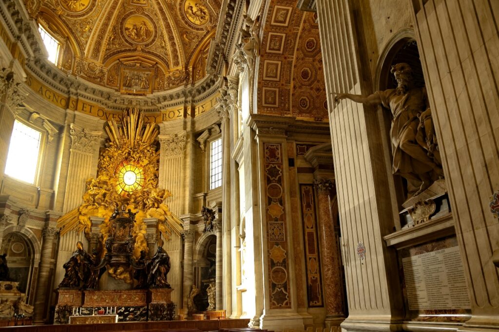
A gripping political thriller set within the Vatican, “Conclave” thrives on its use of grandiose interiors and dramatic chiaroscuro lighting. The film’s design emphasizes the opulence and secrecy of its setting, creating a heightened sense of intrigue. Subtle but powerful production choices, such as intricate papal robes and cavernous, candlelit halls, reinforce the weight of its narrative. The dominant color palette consists of deep reds, golds, and blacks, symbolizing power and mystery.
Wicked
Audience score: 95%
Critics score: 88%
Bringing the beloved musical to the screen, ‘Wicked’ shines with a vibrant, magical aesthetic. Elaborate sets, whimsical costuming, and dynamic lighting work together to transport audiences to the magical land of Oz. “Bright colors and organic set pieces like flowers and fields planted just for the movie really brought the iconic world of Oz to life,” Lisa Dawn with The Princess Blog adds. “Unusual architecture including rotating bookshelves and doorless trains provide a constant reminder that this is not the same world we live in. The signature pink and green colors of the two main characters are reflected consistently through the film’s lighting, costumes, and environments.”
Bright, jewel-toned colors, along with a pink and green juxtaposition noted by Dawn, dominate the visual style, contrasting the whimsical and dark elements of the story while immersive camera work captures the grandeur of the performances. “‘Wicked’ has such a rich color palette, highlighting the complementary pink and green while still immersing viewers in a whimsical and vibrant world that includes every other color in between,” the team at In My Opinion Flicks explains. “‘Wicked’ is visually anything but plain and dull with its light, fluffy, and fantastical atmosphere. It trades straight lines and neutral colors for natural bends and bright, vibrant hues. ‘Wicked’s stylistic choices would translate beautifully into a fantasy-themed, otherworldy room. This approach draws from elements of the natural world and takes it up a notch. Colors are brighter and there are no sharp edges in sight.”
A Complete Unknown
Audience score: 96%
Critics score: 81%
This Bob Dylan biopic embraces a raw, organic visual style to capture the shifting cultural landscape of the 1960s and beyond. The cinematography relies on natural lighting and grainy textures to evoke a documentary-like authenticity, immersing audiences in Dylan’s world. The film’s design echoes the era’s countercultural movement, with warm sepia tones and soft-focus shots, lending a nostalgic feel.

Dune: Part Two
Audience score: 95%
Critics score: 92%
Continuing the visually stunning saga, “Dune: Part Two expands upon its predecessor’s intricate world-building. “The production design of ‘Dune: Part 2’ is all in service of creating an atmosphere that is visually inhospitable and bleak, from the endless dunes to the rocky crags to the near-blinding whites and tans,” Kevin Jordan with Ruthless Reviews details. “Even the machines and structures used on the planet seem to be falling prey to the planet, as evidenced by the wear and tear seen on all surfaces caused by the unstoppable erosion of sand that is everywhere. But it also serves to show the defiance and strength of the natives of Arrakis, people who have not only overcome the hostility of the world but learned to use it to their advantage.”
Sand-toned hues, deep shadows, and high-contrast lighting enhance the film’s sense of vastness and danger, while intricate costume details highlight the blend of futuristic and archaic influences. “In ‘Dune: Part Two,’ the production design masterfully blends monumental architecture with intricate details to create immersive worlds. The Imperial Planet, for instance, showcases gardens and architecture inspired by Italian architect Carlo Scarpa, whose designs balance brutalist strength with delicate details a fitting aesthetic for the grandeur of the Imperial setting,” Anthony Whyte with The Movie Blog shares. “This juxtaposition of massive structures with refined elements not only enhances the storytelling but also offers inspiration for interior design, where combining bold architectural features with subtle, intricate details can create spaces that are both grand and inviting.”
Robert Kwalick, MFA, and executive director with Bantam Cinema & Arts Center further dives into the power of production design, specifically the uniqueness around ‘Dune: Part 2.’ He shares, “Effective production design requires that all visual elements, scenery, costumes, lighting, etc, live within the same universe and are unified in their impact. ‘Dune: Part Two ’ makes use of an internally consistent limited color palette which serves to create a very specific world that has a particular mood, tone, and feeling. While one would likely not use this same color palette as ‘Dune: Part Two’ in interior design, one would be well-served to make use of the principle of the “limited color palette” to create an internally consistent living space that achieves a desired result (stimulating, calming, whimsical, formal, etc).”
Kwalick continues by saying, “Many internal spaces are a hodgepodge of furnishings, decor, wall, and window treatments, resulting in a busy environment that lacks unity, while a carefully curated palette results in the perception of planning and thematic forethought. Like production designers who work in film, interior designers can make use of color to create an impactful and specific impression.”
Nickel Boys
Audience score: 75%
Critics score: 90%
Adapted from the acclaimed novel, “Nickel Boys” employs a restrained but deeply evocative aesthetic to tell its harrowing story. The film’s design choices — faded, sun-washed settings, period-accurate costuming, and deliberate framing — convey a sense of both nostalgia and unease, amplifying the emotional weight of the narrative. The muted, pastel-infused palette contrasts with the film’s heavy themes, emphasizing the innocence lost by its characters.
Anora
Audience score: 90%
Critics score: 94%
Capturing the energy of contemporary urban life, “Anora” takes a more grounded approach with its design. The film’s aesthetic leans into documentary-inspired realism, using handheld camerawork and natural lighting to bring its Brooklyn setting to life. Every detail, from costume choices to set dressing, contributes to the film’s raw, intimate feel, with desaturated tones reflecting the grit of city life.
The Substance
Audience score: 75%
Critics score: 89%
A psychological thriller with a surrealist edge, ‘The Substance’ plays with shadow and color to heighten its unsettling atmosphere. Innovative visual effects, eerie lighting choices, and bold production design help craft a world that blurs the line between reality and hallucination, making it one of the year’s most visually interesting films.
“Coralie Fargeat’s 2025 Best Picture nominee, ‘The Substance,’ features several striking scenes that showcase bold interior design. Horror fans may recognize visual parallels between the film’s dramatic hallway and public restroom sequences and Stanley Kubrick’s 1980 cult classic, ‘The Shining,’” Destiny King with What Sleeps Beneath explains.
“Both films employ deep red tones and meticulous composition, reflecting a resurgence of 1970s contemporary interior design. In particular, the hallway scene in “The Substance” draws viewers in with elongated Art Deco patterns that create a sense of depth and unease. Whether or not you’re a fan of the genre, the film’s design choices are undeniably mesmerizing, immersing audiences in its unsettling yet visually arresting world.”
I’m Still Here
Audience score: 98%
Critics score: 96%
This historical drama uses a mix of soft, sepia-toned visuals and stark, oppressive settings to depict the struggles of its protagonist. The contrast between intimate, warmly lit interiors and harsh, institutional spaces serves as a powerful visual metaphor for the story’s themes of resilience and identity.
The power of cinema and design
Films do more than entertain — they shape culture, influence trends, and subtly weave their aesthetics into everyday life. “We are used to seeing a big variety in the aesthetics of the Best Picture nominees, and this year’s nominees are no different,” Lars B. Frahm with Awardstats.com explains.
“They explore several different kinds of homes. From the lavish LA apartment in ‘The Substance’ to “Conclave’s” minimalist living quarters in the Vatican to the fairytale dorm rooms in “Wicked,” and to downright living in caves in ‘Dune: Part Two.’ I would for one not mind waking up in the apartment from ‘The Substance.’ From the start of the film at least. And without the other inhabitants.”
The impact of film design extends far beyond the screen, influencing everything from color palettes to furniture choices. For instance, the lavish world of “Wicked” may inspire a resurgence of rich jewel tones and opulent textures, while the stark brutalism of “The Brutalist” could spark a renewed appreciation for minimalist, industrial spaces. Even subtler elements — like the warm, nostalgic glow of “A Complete Unknown” — can shape how we style our homes, drawing us toward vintage decor and soft, timeworn materials. Whether grand or understated, cinematic aesthetics often find their way into the way we design and experience our living spaces.
Bringing cinematic influence from the 2025 Oscars Best Picture nominees into our spaces
From intentional color palettes to striking compositions and rich textures, the visual storytelling in these films offers endless inspiration for interior design. As awards season unfolds and the predictions for the winners shift, it will be exciting to see which film’s design resonates most and how its aesthetic influence might translate into our living environments.

