
In the past 12 months, just 16.6% of Cincinnati rentals were listed for under $1,000 – down from 22.6% a year ago.
In recent years, rising rental costs have pushed affordability further out of reach for many renters across the U.S., making finding a home for under $1,000 increasingly difficult. In fact, half of all renters now pay more than 30% of their income toward rent, underscoring the gap between market rates and wages.
Cincinnati, OH bucks this trend; 16.6% of apartments on the market are listed for under $1,000. The nationwide average is 7.5%. But Cincinnati used to be much more affordable.
So what’s happening in the rental market? Why does Cincinnati have a large share of rentals for under $1,000 per month, and why is the share dropping? Let’s dive in to find out.
In Cincinnati, 16.6% of rentals are listed for under $1,000
Cincinnati has the seventh-highest share of rental listings below $1,000 in the country, at 16.6% – a drop from 22.5% last year. However, Cincinnati still has a high share of $1,000 rentals largely because of its low asking rent, which currently sits at just $1,341. The nationwide median asking rent is $1,634.
Even though Cincinnati has one of the lowest median rents in the nation, it’s worth noting that the metro has seen large increases lately – likely because lower rents have fueled demand. Rents have risen around $400 since 2019, and rose 7.3% year over year in September.
Rent increases, paired with a dwindling share of rentals listed for under $1,000, have had compounded effects on low-income residents. Primarily, many Cincinnati renters can’t afford to pay the median rent; 24.8% of residents live in poverty. Black and Hispanic residents are much more likely than white residents to be living in poverty and more likely to rent. Ohio also has no rent control laws.
These factors help explain why nearly a quarter of renters are severely cost-burdened (spend more than 50% on housing). Cincinnati needs at least 49,000 additional affordable units to meet residents’ needs.
Low-income renters have the option to use Housing Choice Vouchers (aka Section 8), but it can be hard to find a building that accepts them, in part because there simply aren’t enough. There is also a budget shortfall heading into next year.
What share of renters in Cincinnati actually pay less than $1,000/month?
Even though nearly a quarter of listings are on the market for under $1,000, far more (54.9%) Cincinnati renters pay less than $1,000 per month. This share is tied to the apartment unit and not an individual renter.
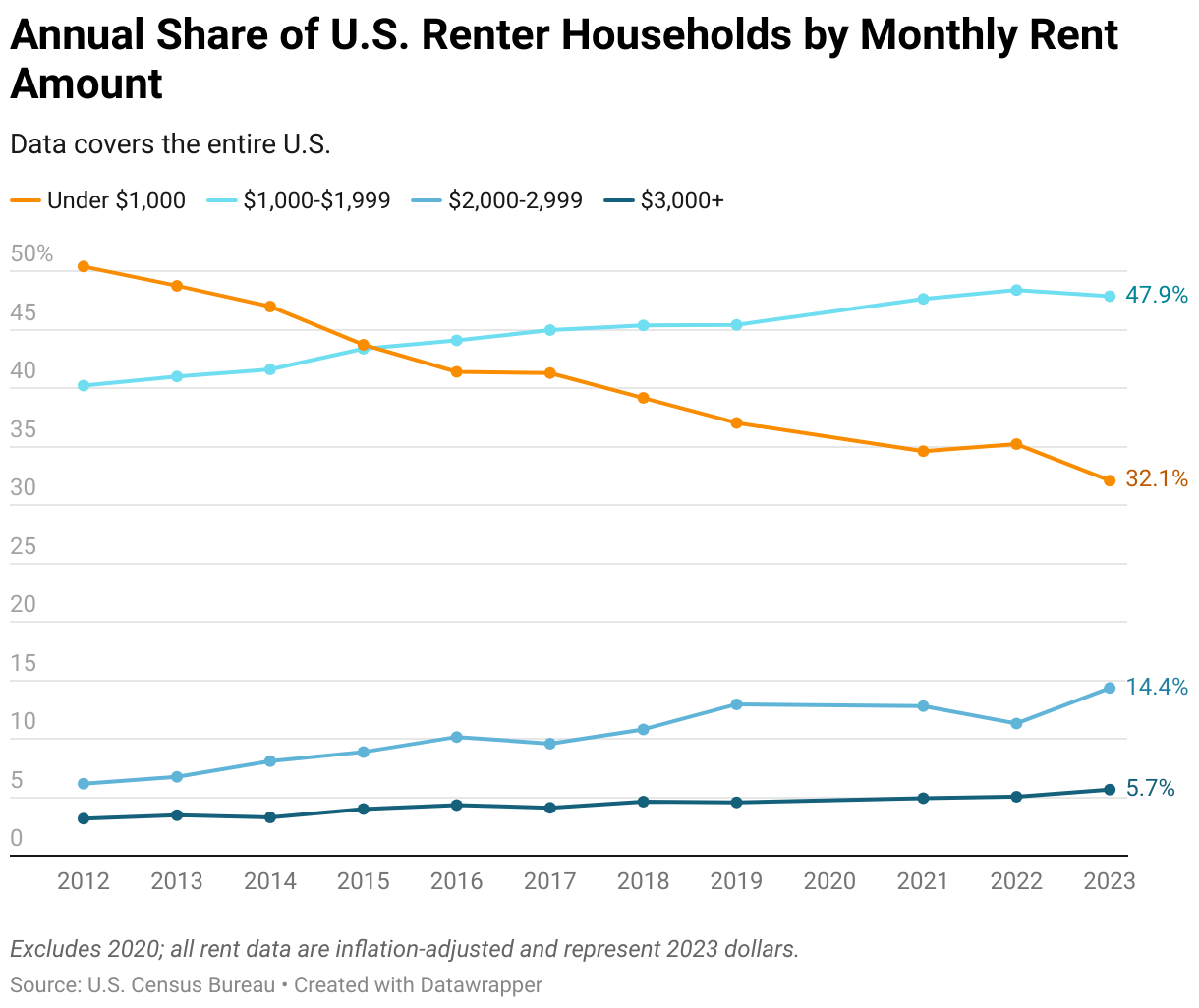
A much higher share of renters pay less than $1,000 per month because many signed leases long ago when rents were much lower. Unsurprisingly, this share has decreased in the past decade, from 80% in 2012 to 54.9% today. Steadily rising rents are the primary culprit behind the drop.
However, this drop is relatively small compared to some other metros. In nearby Orlando, for example, nearly 50% of renters spent less than $1,000 on rent in 2012. Today, that figure has dropped to just 11%.
The share of $1,000 rentals has declined nationwide
Nationwide, 7.5% of listings on the market cost less than $1,000. This is a 0.1 percentage point (ppts) increase from the same time last year, but well below the 10% share in September 2019. Why are $1,000 rentals becoming less common?
The primary reason is because rents have increased dramatically. Rents skyrocketed during the pandemic because of a moving frenzy, housing boom, and lack of new construction. They reached a record high of $1,700 in August 2022, with some metros seeing $700 increases over only a few months.
Rents have since stopped rising and even declined in a few places over the past few months, but are still up nearly 21% from before the pandemic. This has massively strained lower-income renters.
How many renters nationwide pay less than $1,000/month?
Nationwide, 32.1% of renter households pay under $1,000 in monthly rent. This far outweighs the share of $1,000 listings, but is the lowest share on record. In comparison, 37% of renters paid less than $1,000 in 2022, and in 2012, the share was 50.4%.
This gap exists largely because many renters signed their leases years ago when housing was more affordable. Many of these renters are also staying put because they can’t afford the typical apartment on the market today. Property owners do often raise rents for existing tenants, but these increases are usually smaller than the increases they apply when seeking a new tenant.
Renters who are paying less than $1,000 a month are also more likely to have lived in their apartment for five years or longer.

Metro-level highlights
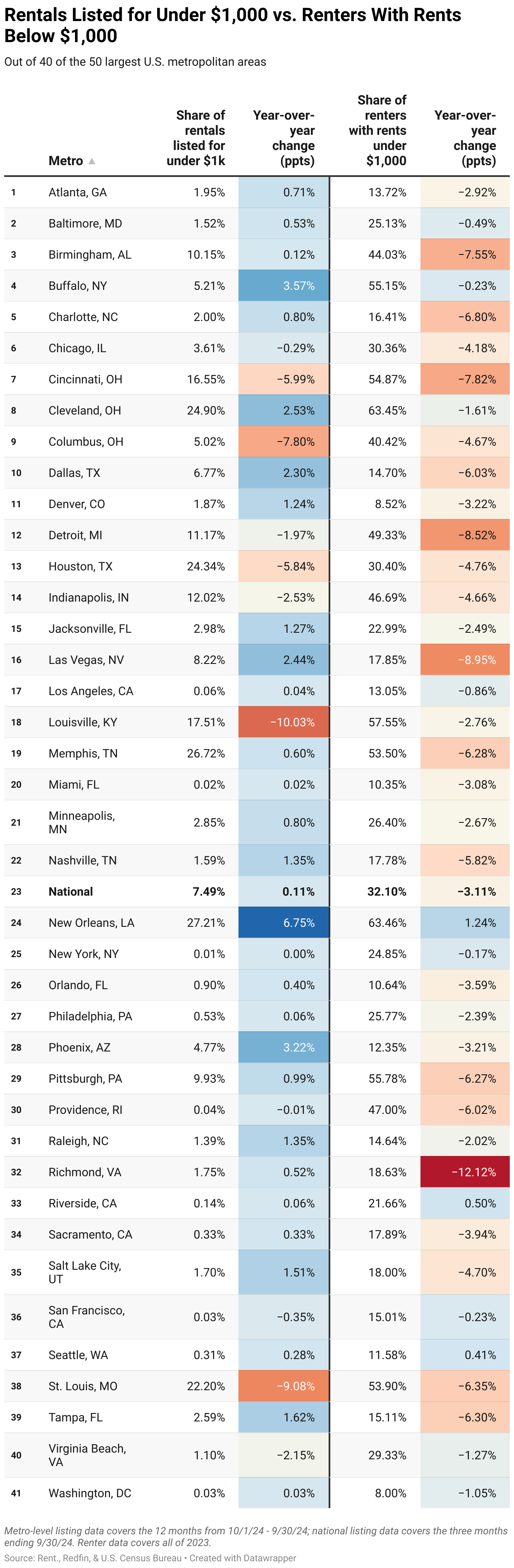
Around the country, there are 13 metros that have less than 1% of rentals listed for under $1,000, while 7 metros have fewer than 0.1%. The four metros with the lowest share of $1,000 rentals are New York (0.01%), Miami (0.02%), San Francisco (0.03%), and Washington, D.C. (0.03%). Median asking rents in these areas all top $2,000.
At the other end of the spectrum, five metros have over 20% of rentals listed for under $1,000: New Orleans (27.2%), Memphis (26.7%), Cleveland (24.9%), Houston (24.3%), and St. Louis (22.2%). These places are all among the most affordable for renters in the country, with median rents around $400 below the national average.
It’s worth noting that many of the most affordable metros have seen large rent increases lately – likely because low rents have fueled a rise in demand. The median asking rent in Cleveland, for example, rose 11.1% year over year in September – one of the largest jumps in the country. Louisville also saw a sizable increase.
When looking at the share of renters paying less than $1,000, New Orleans tops the charts at 63.5%, with Cleveland (63.5%) and Louisville (57.6%) close behind.
Two interesting metros are Phoenix and Las Vegas, which saw some of the largest year-over-year declines in the share of renters paying under $1,000. Phoenix dropped 15.7 ppts (28.1% to 12.4%), and Las Vegas fell 14.7 ppts (32.5% to 17.8%). Both cities surged in popularity during the pandemic, which drove up demand for housing and, in turn, rents.
$1,000 rentals: Complete metro-level data

Methodology
Based on a Redfin analysis of data from the U.S. Census Bureau, Redfin.com, and Rent.com.
The data on the share of rental housing by price point and length of stay comes from the U.S. Census Bureau’s 2012-2023 American Community Surveys (ACS*) for units in apartment buildings with five or more units. 2020 data is excluded due to pandemic-related data collection issues. This data has been inflation-adjusted and represents 2023 dollars.
The data on the share of rental listings by price point comes from Redfin and Rent. and covers units in apartment buildings with five or more units. This data, which is based on asking rents, has been inflation-adjusted to reflect values in September 2024 dollars.
*ACS data was retrieved from IPUMS USA:
Steven Ruggles, Sarah Flood, Matthew Sobek, Daniel Backman, Annie Chen, Grace Cooper, Stephanie Richards, Renae Rodgers, and Megan Schouweiler. IPUMS USA: Version 15.0 [dataset]. Minneapolis, MN: IPUMS, 2024. https://doi.org/10.18128/D010.V15.0


